You worked on your website for hours or even weeks. You chose the colors, put in some cool pictures, and even added a contact form. Still, people visit and then leave without buying, signing up, or even clicking.
Sounds familiar?
If this is the case, the issue may be with your website design.
Even if your site looks updated, bad design choices can kill your sales in the background. As a result, there will be fewer leads, fewer sales, and numerous lost chances.
Here are five mistakes that many business owners and freelancers make with their web design that they don’t even know it. I’ll also use simple tools and examples to show you how to fix each one.
1. Slow Page Load Speed
❌ Your website takes too long to load.
People will notice your speed before they even see your style. Google says that 53% of people will leave a page that takes more than 3 seconds to load.
⚠️ Why It’s Not Good
- Some people think your website is broken or not professional.
- People who might become leads leave before they even see your material.
- Sites that load slowly get fewer clicks from Google.
✅ How to Fix It:
Use tools that speed things up:
- Google PageSpeed Insights
- GTmetrix
- Pingdom Tools
Quick Fixes:
- Use TinyPNG or ShortPixel to shrink images.
- Instead of JPEG or PNG, use WebP.
- Put in a tool that caches your site, like WP Rocket or LiteSpeed Cache.
- Delete themes, plugins, and big files that you don’t use.
- Cloudflare is a good content delivery network (CDN) to use.
2. A bad navigation system:
❌ Users don’t know where to go
People should be able to use your website without getting lost. People will leave if the menu is crowded, pages are hidden, or there are too many options
⚠️ Why It’s Not Good
- People aren’t able to find what they need.
- Bounce rate goes up
- Lowers trust and professionalism.
✅ How to Fix It
Keep the choices neat and clean:
- Show only 5–7 main menu items.
- Don’t use too many dropdowns.
- Put pages that are similar together on the same tab, like “Services.”
Labels should be simple:
- Do not write “What We Offer.” Instead, write “Services.”
- Get in touch with us instead of “Let’s Connect.”
For bigger sites, add site maps and links. This makes it easier for people to find their way and also helps SEO.
💡 Pro Tip:
Install Yoast SEO or Rank Math to have WordPress automatically make links.
3. Lack of or weak call-to-actions (CTAs)
❌ Visitors don’t know what to do next.
That action could be making a call, buying something, or signing up for your email. Each page on your website should clearly lead people to that action.
⚠️ Why It’s Not Good
- Visitors look around, get lost, and leave.
- You skip the chance to turn attention into action.
✅ How to Fix It
Write clear CTAs that focus on benefits:
Bad: “Click here”
Better: “Download the free guide”
Best: “Get My Free 30-Minute Strategy Session”
- Make your call-to-action buttons stand out:
- Use bright colors that stand out from the background.
- Keep your phone’s buttons big and easy to tap.
- Use CTAs over and over on your page.
Put call to action buttons where they will be seen:
- After a sentence that lists the benefits
- At the end of blog posts
- In the header or bottom of your site
💏 Pro Tip:
To make it easy to make CTA parts that convert well, use tools like Thrive Architect or Elementor.
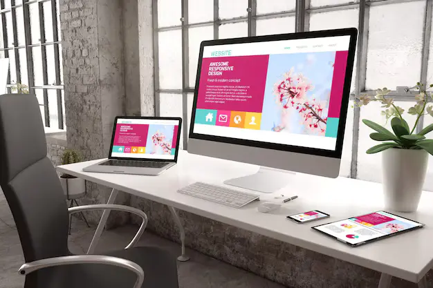
4. Bad Mobile Optimization
❌ Your website only looks good on computers
More than 60% of web traffic in 2025 will come from phones. Most of your visitors will leave if your site doesn’t work well on phones.
⚠️ Why It’s Not Good
- People can’t read the words or press the buttons, which is bad.
- The layouts are broken or look squished.
- It gets tough to use forms and pop-ups.
✅ How to Fix It
- Use a WordPress theme that is flexible, such as Astra, Kadence, or GeneratePress.
- Use the Mobile-Friendly Test Tool from Google.
- Try it out on various gadgets (iPhone, Android, tablets, etc.)
- Clicks and words should be bigger on small screens.
- Stay away from full-screen popups that hide information.
💏 Pro Tip:
A lot of the themes that come with Elementor are already mobile-friendly. But you should always make them fit the way your audience acts.
5. Too hard to understand or crowded layouts
❌ It’s a mistake that you want to show everything at once.
A lot of websites try to fit all of their services, recommendations, blog posts, and newsletter pop-ups onto one screen. This is too much for people.
⚠️ Why It’s Not Good
- Too many options make it hard to make a choice.
- People aren’t sure where to look.
- It makes your business look sloppy or desperate.
✅ How to Fix It
- Let your design breathe by adding white space.
- Each page should only have one goal, like “sign up,” “buy,” or “book.”
- Separate the text into parts with clear titles.
- Include only things that make the list better.
Sort things out:
- The headlines should be bigger and strong.
- Use subheadings to add more information.
- List the most important things at the top of the page.
💏 Pro Tip:
To learn how strong simplicity can be, look at simple websites like Apple or Notion.
BONUS: Not checking or keeping track of results
Websites need to be updated all the time, even ones that look good. The way users act changes. Trends change. You can’t just leave your site alone.
✅ Things You Can Do
- Check Google Analytics to see where people stop using your site.
- To make heatmaps and record your screen, use Hotjar or Microsoft Clarity.
- You can compare different button colors, headers, or calls to action (CTAs) by running A/B tests.
Do You Need Help With Your Site?
We can help if you feel too busy or stressed to handle everything on your own.
At Preet Web Vision, we help small businesses and online stores build fast, user-friendly websites that convert visitors into customers.
📞 Phone: +63-9633112000
📧 Email: hello@preetwebvision.com
🌐 Website: Preet Web Vision
We also create free video tutorials on:
- WordPress design
- SEO tips
- Digital marketing strategies
- Tools and plugins reviews
🎥 Preet Tech Ideas (English)
🎥 Preet WebXP (Hindi)
Subscribe today and start improving your site in simple, practical steps.
Last Thoughts
There’s no need for your website to be fancy or cost a lot of money. But it does need to be easy to understand, quick, and focused on how your visitors feel.
Start by not making the five mistakes we talked about:
- Loading times are slow
- Not clear directions
- Not strong CTAs
- Bad design for mobiles
- Spam-filled layouts