One thing I’ve learned from years of building websites for myself and for clients is that design can make or break sales. You can have the best product, the smartest copy, or the best deal… But if your website looks old, confuses visitors, or doesn’t seem trustworthy, those sales won’t happen.
And 2025 is a whole new ball game.
People’s behavior has changed quickly, and their attention spans are even shorter than they were three years ago. People want things to load quickly, be clear, and look great, but not the kind of extra design that makes your site slow down. They want websites that look new and make it easy to make choices.
In this long, fully detailed guide, I’m breaking down the Top 10 Website Design Trends in 2025 That Actually Boost Conversions—not trends that “just look cool,” but trends backed by psychology, data, and real-world performance.
These are the same rules that companies like Preet Web Vision use to make websites that work well for brands all over the world.
These trends are very useful if you want to redesign your site, make a new one, or just make your UX better.
Let’s get started.
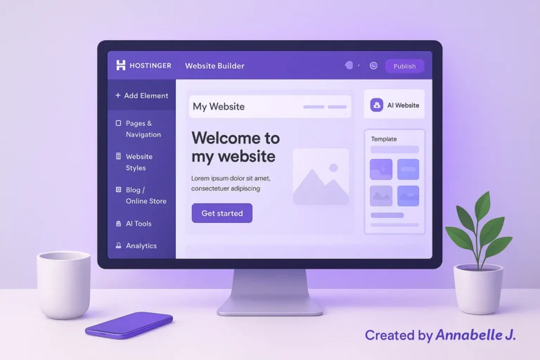
Trend #1: Conversion-Driven Minimalism (The “Less But Better” Approach)
Minimalism isn’t new, but it has changed a lot since 2025. We’re not talking about empty spaces and small fonts anymore. Minimalism today is goal-oriented, with an emphasis on clarity, psychology, and user flow.
Why this trend increases sales
A person who goes to your page shouldn’t have to think. They should know right away:
- where they are,
- what you offer,
- and what they should do next.
This new wave of minimalism takes away decision fatigue and makes your CTAs stronger.
This is what modern minimalism will look like in 2025:
✔ Big, bold, fast-loading typography
✔ A single color accent (instead of rainbow palettes)
✔ Spacious layouts with intentional breathing room
✔ Hero sections with clear one-sentence value propositions
✔ Reduced navigation—from 7+ links to 3–4 max
✔ Lightweight animations instead of heavy scripts
✔ 1–2 focal points per page
Real-life example
When we redesigned a service website at Preet Web Vision, we removed the cluttered sidebar, simplified the homepage to a single bold headline, and moved the main CTA above the fold.
Result?
42% more leads submitted in 30 days.
People don’t want to go through a maze; they want a clear path.
Helpful advice for beginners
- Begin with a wireframe (boxes, not colors)
- Remove elements that don’t help users make decisions
- Keep each page focused on one main goal
- Test your page by asking: “Can a new visitor understand everything in 5 seconds?”
Trend #2: Hyper-Personalized Experiences (AI-Enhanced UX)
Websites in 2025 are no longer static. They change based on:
- location,
- browsing history,
- device behavior,
- interaction patterns,
- and even user intent signals.
AI-powered tools have made it easier than ever to personalize this much, even for small websites.
How personalization increases sales
Visitors are more likely to convert when the content seems relevant.
Think about this
A person visits your blog twice to look for “WordPress speed optimization.” When they come back for the third time, your homepage shows:
- A speed optimization service
- Related articles
- and a case study
This doesn’t feel like pressure; it feels like help.
Personalization examples trending in 2025
- Smart product recommendations (based on browsing patterns)
- Personalized hero messages (“Welcome back! Ready to continue?”)
- Adaptive CTAs (e.g., showing “Download PDF Guide” if user avoids contact forms)
- Content based on region or time
- Recommending pricing tiers based on user’s past clicks
- AI chat widgets that remember previous questions
A story from our agency
We worked with a local coaching brand that had a lot of traffic but not many conversions. After looking at behavior patterns, we added personalized CTAs based on:
- scroll depth
- time on site
- and previous visits
Visitors who looked at more than two service pages saw a personalized call to action: “Book a Consultation—We’ll Help You Build Your Next Step.”
In six weeks, the conversion rate went up by 31%.
Simple ways to use personalization for beginners
- Use conditional blocks in Elementor or Gutenberg
- Show different CTAs on desktop vs. mobile
- Offer dynamic popups depending on scroll behavior
- Use geolocation to show city-specific offers
- Let returning visitors skip long forms automatically
You don’t need to be a tech expert; just personalizing things can make a big difference in how users feel.
Trend #3: Micro-Interactions That Make Users Feel “Guided”.
Micro interactions are the small, almost invisible things that help users as they scroll, click, type, or hover.
They are like the “body language” of your website—little cues that confirm what a user is doing, get them more involved, and make the experience feel real.
Why micro-interactions matter in 2025
Users expect quick feedback because mobile use is so common.
They think something is broken if they tap a button and nothing happens, even for a second.
Micro-interactions comfort them with small, pleasant responses like:
- Buttons that slightly pop when clicked
- Toggles that slide smoothly
- Icons that animate on hover
- Forms that shake gently when an error occurs
- Progress bars that show form completion
These moments might seem small…
But in conversion design, small things can mean a lot.
How micro-interactions improve conversions
- They reduce user frustration
- They make forms feel easier
- They keep users scrolling longer
- They increase “perceived responsiveness”
- They make CTAs more clickable
- They create a sense of trust — people feel guided
A short story about real client work
At Preet Web Vision, we once redesigned the pricing page for a brand of digital products. The old page looked fine, but people weren’t clicking on the pricing tables.
So we did three things:
- Added micro-hovers to the pricing cards
- Animated the “Recommended” plan slightly when in view
- Added a micro-checkmark animation when users clicked “Select Plan”
What’s the difference?
People looked at the plans 54% more, and conversions went up by 28% without changing a single word.
Simple ways for beginners to add micro-interactions
You don’t need to know how to code well. You can use:
- Elementor Page Transitions
- Lottie icon animations
- CSS hover effects
- Scroll-trigger animations
- Button ripple effects
- Animated progress bars in forms
Just remember: Don’t use too many micro-interactions at once.
They should make things clearer, not more confusing.
Trend #4: Ultra-Fast, Lightweight Websites (Speed as a Design Language)
Speed has always been important.
In 2025, though, it’s not just an SEO factor; it’s a design trend on its own.
Why speed is more important than ever
People want websites to load right away. Not quickly.
Right away.
And when they don’t, users leave or stop trusting them (often without realizing it).
There is a big shift toward speed-first design, where the whole site is built to be lightweight from the ground up.
What ultra-fast design will look like in 2025
- Clean, minimal scripting
- Replacing heavy animations with lightweight CSS
- Optimizing layout shifts to avoid “jumping” elements
- Using variable fonts instead of loading multiple font files
- WebP/AVIF images as default
- Preloading hero-section assets
- Using SVG icons instead of PNGs
- “Skeleton screens” to improve perceived speed
Why speed now directly increases conversions
When your site feels like it happens right away:
- users scroll more
- they click more
- forms feel easier
- checkout pages feel smoother
- trust increases
And trust is what really makes people buy things.
What the 2025 Core Web Vitals update from Google changed
In 2025, Google really pushed:
- Interaction to Next Paint (INP)
- Cumulative Layout Shift (CLS)
- Speed Index
- Input Delay
This means that websites that are slow and full of junk are getting lower rankings, especially on mobile.
An example of before and after
A fitness coach came to Preet Web Vision with a beautiful but very heavy website that had auto-play videos and big backgrounds.
How long does it take to load on mobile?
A painful 8.9 seconds.
We rebuilt the site with speed-first design in mind:
- compressed media
- removed heavy JavaScript
- switched to clean SVG icons
- replaced video background with a still image
New load time: 1.7 seconds.
In eight weeks, the conversion rate went from 2.1% to 5.6%.
Fast design is clean design…..and clean design converts.
Steps for beginners to make a lightweight site
- Compress images using TinyPNG or ShortPixel
- Only install essential plugins
- Avoid loading fonts you don’t use
- Replace sliders with static hero images
- Minify CSS, JS, and HTML
- Use a modern caching solution
- Don’t install “all-in-one” bulky themes
Keep in mind that: A website that loads quickly seems more professional, expensive, and trustworthy.
Trend #5: The Rise of Bold, Purpose-Driven Typography
In 2025, typography officially became a hero element.
It’s not just words anymore; it’s a design element.
The days of thin fonts and headings that are too subtle are over. Websites that convert well today use typography that:
- grabs attention
- communicates personality
- simplifies scanning
- guides the eyes
- strengthens the brand
Why typography is now a factor in conversions
Most people don’t “read” websites; they just skim them.
Bold, easy-to-read fonts help them find:
- the value proposition
- the benefits
- the CTA
- the conclusion
Typography also sets emotional tone.
- A bold serif creates authority.
- A round sans-serif feels friendly.
- A geometric font feels modern and tech-driven.
The most popular types of fonts in 2025
✔ Big, oversized headings
✔ Variable fonts (lightweight and dynamic)
✔ High contrast for accessibility
✔ Clean sans-serifs paired with expressive sub-headings
✔ Typography used as imagery (text-as-art layouts)
✔ Tight-but-readable line spacing
✔ Elegant serif fonts for luxury brands
An example you’ll understand
The text on the homepage of a beauty startup was small, gray, and hard to read when we redesigned it.
We changed it by using:
- a bold modern serif for headlines
- a clean sans-serif for body text
- black + gold contrast for luxury feel
The result?
People stayed on the homepage 2x longer, and clicks to the “Shop Now” button went up noticeably.
Typography mistakes beginners should avoid
❌ Using too many font families
❌ Using low-contrast colors
❌ Using thin fonts on small screens
❌ Stretching or squeezing fonts
❌ Mixing serif + serif or sans + sans in confusing ways
Simple typography tips for non-designers
- Use one serif + one sans-serif combo
- Stick to a 3-level hierarchy (H1, H2, body)
- Never go below 15–16px for body text
- Test your site’s readability on a small phone
- Increase letter spacing for uppercase text
Your website instantly feels more high-end and convincing when you use typography on purpose.
Trend #6: Story-Driven Scrolling (Narrative Web Design)
One of the biggest changes in website design in 2025 is the move toward story-driven scrolling. With this feature, the website unfolds like a story as the user scrolls down the page.
This trend combines storytelling, animations, images, and small interactions to make a guided journey, like a mini-documentary inside your website.
Why narrative design increases conversions
People remember stories much better than facts or features.
When you tell a story with the layout of your website, you:
- keep users engaged longer
- build emotional connection
- help visitors understand your offer faster
- reduce bounce rate
- guide users toward a specific decision
A good story on your homepage makes it a “silent salesperson” that does the talking for you.
What story-driven design looks like
- Smooth scroll-triggered animations
- Step-by-step product explanations
- Visual storytelling blocks
- Sequential “chapters” on the homepage
- Progress indicators
- Scrollytelling graphics
- Interactive timelines
An actual example from client work
A coffee brand that cares about the environment asked Preet Web Vision to make their homepage look more “alive” instead of the usual grid layout.
We used a step-by-step story to redesign the page:
- The problem → harmful mass-produced coffee
- The discovery → ethically sourced beans
- The process → slow roasting
- The impact → fair wages for farmers
- The offer → subscription box
- The CTA → “Try Your First Bag”
The smooth animations slowly revealed each section.
The result?
Visitors spent three times longer on the homepage, and conversions went up by 37%.
Beginner’s guide to making story-driven pages
- Map your story in 5–7 “chapters”
- Use visuals to break up text
- Add subtle scroll animations (not too many!)
- Guide users with headings that feel like plot points
- End each section with a micro-CTA
This method works great for:
- Product brands
- Coaches
- SaaS companies
- Service providers
- Personal portfolios
People trust a brand when they can feel the journey.
Trend #7: Authentic, Imperfect, Humanized Design
You might be surprised to learn that websites in 2025 are moving away from “polished corporate perfection” and toward “raw authenticity.”
People are sick of stock photos that are too perfect, product shots that are too edited, and websites that look like they were polished by twelve different groups.
People want things that are real, warm, and have a personality.
Why design that isn’t perfect works
Because flaws make things feel real.
A small hand-drawn icon.
A candid behind-the-scenes photo.
A founder introduction video that isn’t overproduced.
These things make people trust you faster than shiny, fake corporate design.
Examples of humanized design that work well in 2025
✔ real team photos instead of stock faces
✔ founder messages directly on the homepage
✔ handwritten elements or doodles
✔ organic color palettes
✔ imperfect shapes
✔ casual microcopy (“Hey, you’re here! Nice.”)
✔ short storytelling captions
✔ textured backgrounds
✔ lifestyle-based visuals instead of staged shoots
This trend grew in part because people today value honesty.
They want to know who is behind the brand.
A story from Preet Web Vision
A bakery owner in the area came to us and asked for a “high-end modern website.” But after looking at their Instagram, we saw that customers were very interested in:
- Behind-the-scenes baking clips
- Messy chocolate drips
- Handwritten recipe cards
Instead of making a website that looked like a business, we made something more welcoming:
- Textured backgrounds
- Imperfect illustrations
- Unedited ingredient shots
- Handwritten-style headings
Not only did sales go up, but customers also said:
“Your website feels like your bakery.”
That’s the power of authenticity.
How beginners can take advantage of this trend
- Use photos of your real team
- Add hand-drawn arrows or accents
- Use textures like paper, canvas, wood, or grain
- Write microcopy that feels conversational
- Add videos without over-editing them
- Share your brand story visually
You don’t need to be “perfect” to convert; you just need to be there.
Trend #8: Conversion-Focused Mobile Layouts (Not Just Responsive… Purpose-Built)
Responsiveness used to mean making the desktop layout smaller.
But in 2025, mobile will have its own set of design rules.
Almost 70% of conversions happen on mobile devices now, and brands finally get that mobile design shouldn’t be an afterthought; it should be the main layout.
Why designing for mobile first affects conversions
On mobile, people:
- read less
- skim faster
- scroll with their thumb
- decide quicker
- get frustrated faster
So, mobile design now has its own unique ways of getting people to convert that are different from desktop design.
Mobile design trends for 2025 that will increase conversions
✔ sticky bottom navigation
✔ thumb-friendly CTA placement
✔ card-style content blocks
✔ collapsible sections
✔ shorter paragraphs
✔ single-column layouts
✔ swipe interactions
✔ floating “Call” or “WhatsApp” buttons
✔ minimalist product pages
What we’re doing differently at Preet Web Vision
We used to design for desktop first and then make it responsive a few years ago.
But now, we build a lot of our layouts with mobile in mind first, especially for:
- Coaches
- eCommerce stores
- Restaurants
- Local businesses
- Personal brands
We start by making a map:
- Thumb zones
- CTA positions
- Fold height
- Scroll flow
- Screen coverage
The desktop layout is based on the mobile layout.
Real-world example
A digital education brand had a website that was mostly for desktops, and it didn’t get many mobile conversions.
The hero section looked great on a computer, but on a phone, it pushed the call to action far below the fold.
We rebuilt the mobile layout:
- cut the hero height
- moved the CTA into view
- added collapsible FAQs
- added a floating CTA on scroll
The change led to a 52% rise in mobile conversions in just 21 days.
Tips for beginners
- Always check your mobile fold height
- Keep headings bold and short
- Avoid side-by-side columns — stack everything
- Use sticky bottom bars for your primary CTA
- Minimize text and emphasize visuals
- Test with your own thumb — can you navigate comfortably?
Mobile-first design is not an option in 2025; it is the most important part of conversion optimization.
Trend #9: Interactive Product & Service Visualization (See Before You Choose)
The internet has become more visual in the past few years, but 2025 has taken it to a whole new level.
People don’t want to “imagine.”
They want to see what they’re getting right away, clearly, and interactively.
This need has brought interactive visualization into the spotlight. And believe me, conversions go through the roof when users can see something.
Why interactive visuals help sales
Because they make the gap between curiosity and commitment smaller.
When people are able to:
- Rotate a product
- Preview a service outcome
- Zoom in on details
- Customize colors or versions
- See a before–after comparison
Their decision-making gets ten times faster and much more sure.
2025 trends in visualization that are doing very well
✔ 360-degree product viewers
✔ interactive color and style selectors
✔ “before and after” sliders
✔ 3D room or space previews
✔ on-hover tooltips explaining features
✔ clickable diagrams for service-based websites
✔ interactive pricing calculators
✔ AR previews via mobile
Micro-visualizations are now being used by even service-based businesses:
- Interior designers show room transformations
- Dentists display before-after smiles
- Coaches show progress maps
- Website designers showcase UI changes interactively
- Restaurants show dish build-ups or ingredient breakdowns
An example from our agency
A brand that sells handmade furniture online came to us for help with getting more people to buy their products. The pictures were pretty, but they didn’t move. Visitors weren’t getting the full picture of the craftsmanship, textures, or size.
We added:
- An interactive 360° view
- Material selector
- Room-size preview
- On-hover details showing dimensions
The effect?
Visitors spent almost 40% more time on product pages, and conversions went up a lot.
Easy ways for beginners to use interactive visuals
You don’t need to do complicated 3D modeling. Here are some easy choices:
- Use “before-after” sliders for case studies
- Add image hotspots that explain features (Elementor supports this)
- Create tappable icons for service explanations
- Add zoom-on-hover for product photos
- Use short GIF-like motion graphics
- Add comparison grids that animate on click
Even small interactive elements make things more interesting, clear, and convincing.
People believe what they can see, especially online.
Trend #10: Emotion-Driven CTAs and Smart Conversion Nudges
CTAs aren’t just buttons anymore in 2025.
They are small strategies that use emotional, behavioral, and contextual triggers to get people to do something.
CTAs like “Submit,” “Buy Now,” or “Click Here” that are old-fashioned don’t seem real.
People just scroll right past them.
The modern CTA method combines:
- User psychology
- Timing
- Context
- Emotion
- and intention
This makes it feel like action is natural, not forced.
Why emotional CTAs work better
People don’t always act on logic first; they act on feeling, desire, connection, or urgency.
These types of CTAs are doing very well this year.
1. Value-driven CTAs
They don’t focus on the action; they focus on the benefit.
Example:
- “Get My Free Audit”.
- “Show Me How It Works”.
- “Start My Website Makeover”.
- “Try the Demo Experience”.
2. Emotional CTAs.
These talk directly to the visitor’s pain or goal.
For example
- “I Want More Traffic”
- “Fix My Website Issues”
- “Help Me Build My Brand”
- “I’m Ready to Grow”
3. Reassurance CTAs
Great for people who aren’t sure if they want to buy.
For example:
- “No Credit Card Required”.
- “Cancel Anytime”
- “100% Free Trial”
4. Progress CTAs
They show that the next step is to act.
For example:
- “Continue to Step 2”
- “Show the Plan That Fits Me”
Smart conversion nudges that are becoming popular in 2025
- Exit-intent popups that show a limited-time bonus
- Scroll-triggered CTAs
- Time-based nudges (“You’ve been here 45 seconds — need help?”)
- “Low stock” or “limited spots” indicators
- Interactive chat CTAs
- Sticky bottom-bar CTAs on mobile
- Trust-boosting testimonials next to CTAs
A story from Preet Web Vision
A coaching brand we worked with had a great website, but sales didn’t go up.
The CTAs were all generic:
- “Learn More”
- “Book Now”
We changed them to emotional CTAs like “Start Building Your Life Upgrade” and reassuring CTAs like “Your First Call Is Free—No Pressure.”
Over the course of eight weeks, conversions rose by almost 50%.
Beginner tips for CTAs that work
- Use verbs + emotion (“Start,” “Unlock,” “Transform,” “Fix”)
- Make CTA buttons larger and more contrasting
- Add micro-interactions (hover, pulse, glow)
- Place at least 3 CTAs on long pages
- Test CTA text on mobile — short is better
- Always use one primary CTA per page
Your call to action is your handshake, your invitation, and the thing that gets people to buy.
Give it personality, a purpose, and a human touch.
Conclusion: Designing for 2025 Isn’t About Looking Modern — It’s About Converting with Purpose
When you look at all ten website design trends that will shape 2025, you can see a pattern:
People don’t want “nice websites”… They want experiences that feel natural, personal, and make them feel good about themselves.
The websites that made the most sales this year have some things in common:
- They load instantly
- They guide users gently
- They feel human
- They show clarity instead of clutter
- They help visitors visualize decisions
- They tell a story
- They speak to emotions
- They support mobile-first behavior
In short, web design today isn’t just about how things look; it’s also about how to communicate strategically.
Every scroll, every animation, every headline, and every little interaction…
All of these things affect how a visitor thinks about your brand.
And the truth is that if your website doesn’t keep up with these trends, you’re missing out on potential conversions, trust, and money.
Websites used to be like brochures on the internet….. Now, they’re tools for salespeople on the front lines.
This is the most important thing to remember from this whole guide:
A website that feels alive, human, and well-organized will always do better than one that is just “well-designed.”
Are you ready to make your website better for 2025?
Let Preet Web Vision Make a Website That Will Help You Convert
You already know how quickly digital trends change and how important it is to have a website that keeps up with them if you’ve read this far.
No matter if you’re a small business owner, a blogger, a coach, an eCommerce seller, or a content creator…
Your website should work as hard as you do.
We at Preet Web Vision are experts in,
- High-converting website designs
- Ultra-fast WordPress builds
- SEO-optimized layouts
- Mobile-first experiences
- UX that feels modern, clean, and intuitive
- Branding that feels uniquely yours
- Complete setup, redesigns, fixes, and optimizations
If you want a professional website that follows all 2025 design standards, loads fast, converts well, and looks stunning — we would love to build it for you.
📞 Contact Us
Phone: +63-9633112000
Email:hello@preetwebvision.com
Website: Preet Web Vision
🎥 Don’t forget to check out our YouTube channels
- Preet Tech Ideas (English)
- Preet WebXP (Hindi)
Related Articles You Might Find Helpful
- How to Build Stunning Website Using Only AI
- How to Create a Professional Website in 2025 (Beginner Friendly Guide)
- High-Converting WordPress Popups for Explosive Growth (2025)
I’d Love to Hear from You! ❤️
If you have questions, want personalized advice, or just want to talk about your experience with designing websites… Leave your thoughts in the comments section below.
Your journey is important, and your website should look great in 2025 and beyond.